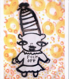
 So last week I got the coolest thing I have received from campus mail at SLU. It was a flyer for this show at the Brush Art Gallery by Melanie Yazzie. The cover of the flyer was the drawing to the left, entitled "Fuck Off w/her Hat."
 This is a really nice piece (and I haven't even made it to the Gallery to see it in person yet) and not just because the "Fuck Off" gave me a chuckle when I picked up my mail. Nor was I entranced just because everything in the design of the image draws your eyes to the "Fuck off," the way that it is centered, the black writing against a bright colored background, etc. I was amused by the juxtapositions. The thick black lines of the figure against the orange and red background. The attempted cutesiness of the figure, with her large wide set eyes, and the actual crassness of the way she is drawn, with those thick black lines (again.) Also, the orange and red marks in the background look like the lip prints from the character that somehow have moved from the world of black and white to the world of color. The title is cool too. It lets you know that "Fuck off" is the name of the character. It also points you to her hat, which, as Molly pointed out to me, looks a lot like a penis. I was impressed enough with the flyer to put it on my office door. Why not, I thought, students will know that this is a work of art, and that the "fuck off" is not directed at them.
well, the day after the flyer went out, the brouhaha started on the fac/staff listserv. People were offended. How dare university money be spent on this flyer! (People seemed to know not to object to the art exhibit, so they just objected to having to look at the flyer.) Someone sarcastically suggested that we all put the flyer on our office doors, to impress visiting parents and students with our maturity. (This actually led me to take down the flyer.) Soon, though, comments got really...dumb. There was an actual "A child could have drawn this!" remark which really bugs me, because I've spent a lot of time looking at childrens’ art, and I know that no child could do that thing with the black figure on a colorful background. People's inability to distinguish child-like drawing from actual children's art mostly tells me that they don't really pay attention to what their children do when they draw. Other remarks included "what if a child saw this!?"
What was even more embarrassing about the discussion was that the best defense people could come up with for the drawing was that art is supposed to provoke. As if no one had looked at any part of the picture besides the words "Fuck Off." Then people started sending emails with the "fuck" in the title of the work starred out: "F*** Off w/her Hat" explaining that the F-word shouldn't be in public email either. I decided the asterisk looked better in the word "off."
Finally Cathy from the art gallery posted and said she was sorry. When she sent the flyers out to the public, they had a warning label that said that this was not appropriate for children. Next time, she said, I will put the warning label on the flyers that go to faculty and staff as well. No one seemed to notice that they had just been told that they were children who needed to be sheltered from dangerous content.
Ok, here's the kicker. These gallery flyers contain material that is not for the prudish all the time. The flyer for the Get Your War On show was laden with profanity. Another flyer had on the inside a comic featuring two giant anthropomorphic turds discussing the history of political cartooning.
So why did this flyer cause the controversy? I think it was exactly the stuff that made it good as a work of *visual* art: the image succeeds in focusing your attention in a way that the clip art of GYWO simply can't. No one was offended by the other images because they weren't compelling enough to look at long enough to notice the profanity. But because Yazzie has visual sense, her drawing becomes controversial.
So this gets at one of my pet theses (I keep theses as pets): the censorious people of the world really are agents of ugliness. Censors are people who are scared precisely by the things that make life interesting. And I'm not talking about words like "fuck" here (although it is dear to my heart). I'm talking about things like color contrast.

No comments:
Post a Comment