I created these charts as a part of my scientific reasoning class. If this is interesting to you, let me know what you think. Click through for bigger versions.
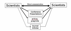
The first simply depicts how scientists communicate among themselves
scicom1
Originally uploaded by rob helpychalk.
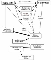
This next chart adds the public to the picture
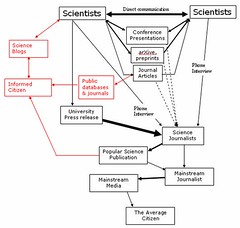
This final chart adds what I hope to be the perspective my students will learn to take.
Tuesday, September 05, 2006
Scientific Communication
Update: Welcome Inside Higher Ed readers. See this updated chart for a better image.
Subscribe to:
Post Comments (Atom)

3 comments:
The science blogs are also fed by mainstream media. I know of a story recently that appeared on a local television station website and was then picked up by treehugger, wired, slashdot, digg, cleantechnica and others. Your third chart is excellent - but misses that big connection.
Yeah, actually I need an arrow from mainstream media to informed citizen. science blogs would then be hooked up to the mainstream media because they are created by informed citizens.
Post a Comment