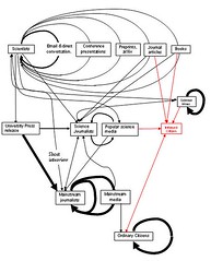
scientific communication 2.0, with informed citizens
Originally uploaded by rob helpychalk.
This is the new version of the chart, thanks to all who offered advice. Again, click through to see a larger version of the chart.
The main thing I did was to add circular arrows to indicate how much groups simply talk to themselves--this also allowed me to get rid of the rather confusing second box for scientists. The chart now emphasizes the insularity of many groups, most prominently ordinary citizens and the mainstream media. Scientists are also quite insular, but this is somewhat disguised by the wide variety of ways they have of talking to themselves. The little insular blogger community is also represented.
I have decided that the difference between the black and the red is that the red is basically normative, while the black is descriptive.
I decided not to add boxes for government and industry, because a lot of the functioning of those institutions is covered by the box "scientists" and because I am mostly concerned with the flow of information to the average citizen. I didn't add a separate box for philosophers of science, because our community is too small to make a difference. I didn't give Gina Kolata her own box because I don't see why everyone thinks she's all that.

No comments:
Post a Comment